Friday, 25 March 2011

L O O K I N G - B A C K - A T - Y O U R - P R E L I M I N A R Y - T A S K - W H A T - D O - Y O U - T H I N K - Y O U - H A V E - L E A R N T - I N - T H E - P R O G R E S S I O N ?

During the process of making my school magazine and the music magazine, I felt that I have learn lot’s of different things, such as the amount of research required for a successful production of a magazine and the fact that every tiny detail matters and has to be related to the connotations and regulation of the magazine. After making the school magazine and receiving feedback, I learnt that everything that is included in SOUNDWAVE has to have a relevant reason for being there that can be related to the target audience or purpose of the magazine.
Time management and photography were not much different when comparing the making of both magazine, but the structure and layout of them significantly changed.
As well as there being more content in the full production, the arrangement of sell lines and information on the cover was planned in much more detail to ensure that the appearance of the cover flows more and there is not more information cluttering the cover than there needs to be. The research into what sell lines my target audience wanted, (which was done by asking them through a questionnaire) showed me that more tag lines and assertive language needed to be used. This shows an improvement in researching when compared to my preliminary task because I did not ask these questions to the school magazines target audience.
The language and structure of the contents page in SOUNDWAVE shows that there was development in arranging the layouts of pages into sections such as ‘featured’ ‘regulars’ and ‘reviews’. This was done through looking at and comparing other music magazines to see what they had, whereas in the mock up of the school magazines contents page, no research was put into what the readers would want and how they would like it to be displayed.
Even though I didn’t create a double page spread article for my preliminary task, I found that I made improvements when creating the article on the Desolate Saints in SOUNDWAVE, through looking at the language used by other journalists and artists being interviewed in other magazines.

Preliminary task cover:

Main task cover:

W H A T - H A V E - Y O U - L E A R N T - A B O U T - T E C H N O L O G I E S - F R O M - T H E - P R O C E S S - O F - C O N S T R U C T I N G - T H I S - P R O D U C T ?


In the construction of my music magazine I used the following programs:
Microsoft Publisher,

Adobe Photoshop


and Macromedia Fireworks.
and also blogger:

I had already used these programs before but the one I knew least about was Macromedia Fireworks. I used Photoshop and Fireworks for editing my pictures but I had hardly used fireworks and it was the most available program on the computers that I was using so it has broadened my knowledge of the program.
I already knew about cameras and owned my own digital slr that I used to take the pictures of my magazine, so I did not gain much experience from taking photographs.
The main things that I learn was developing new skills in Firework and Photoshop such as air brushing people and making the girl on my cover look slimmer than in the original picture using different tools than what I am used to in the programs. This helped me to work much quicker and with more ease. I had never blogged before, but I found it helpful and fun to keep on track with my work. Updating it and sharing progress with people such as my classmates proved helful in showing what I had done so far and gave me a chance to look back and reflect on any developments that could be made.
One limitation that I reached was that the school only provided Microsoft Publisher 2003 in the rooms that I used computers, and I would have preferred to use one of the newer versions available, 2007.

W H A T - K I N D - O F - I N S T I T U T I O N - M I G H T - D I S T R I B U T E - S O U N D W A V E ?


I think that IPC media is the company that is most likely to distribute my product because They are an experienced and well established company with many successful magazine out now. IPC media already publish 2 music magazines, ‘NME’ and ‘Uncut’. Both NME and Uncut are regular music magazines that boarder on the 'rock' side of the general music genre. SOUNDWAVE would be a good magazine to be produced by the company because it would not only introduce them to the rock genre of magazines but also increace their revenue by expanding their target audience to more young women (because that is my magazines main target audience). 
A bit more information on IPC media:

IPC media is one of Britain's leading magazine publishers, focused on provided their audiences with lifestyle and leisure magazines.

W H O - W O U L D - B E - Y O U R - A U D I E N C E - F O R - S O U N D W A V E ?


My main/ideal target audience for soundwave would most probably be:

Age: I am targeting at anyone from the age of about 16 – 22 (although the magazine may gain some audiences a few yeas younger or older).
Location: It is for people living in the UK.

Occupation: The reader audience could be unemployed, still living at home with their parents, have a job or go to university; it doesn’t matter so much to the magazine along as they are young rock music lovers.

Interests: Music, video games, television, films, bands and artists, the latest information on what music is available, anything to do with technology, slightly interested in education (if they are still into education) and their own personal styles and gigs or concerts.

Hobbies: Playing in a band or attending local or large scale gigs, gaming, crafts or painting, anything to do with technology.

Background: Anyone from any kind of background who can afford a magazine, it could be an intelligent, rebelling female who is in her late teens living with their parents in a large house or a 20 year old man who lives in a studio flat above a shop who never got on well at school. Gender: There is no gender preference for this magazine. It is targeted at both males and females.

I N - W H A T - W A Y - D O E S - S O U N D W A V E - U S E / D E V E L O P / C H A L L E N G E - F O R M S - A N D - C O N V E N T I O N S - O F - M E D I A - P R O D U C T S


I have not challenged the conventions of the sell lines by using many with descriptions underneath. However, I have developed this by putting some of the sell lines in block colours which means the audience is drawn to the more important articles because they stand out.
The normal colours of rock music magazines are usually blacks and reds. I was originally going to make my magazine green, however, because i wanted to challenge the norm and appeal to female reader more than males, i decided to make it deep, rich purple colour to make sure it appeared different to the other rock magazines and stood out on a shelf.
The majority of band features have pictures of the whole band on the font, such as NME and MetalHammer, but i decided that i wanted to have jut the lead singer on the front of my band, because she was female and could appeal to the female audience as well as male, and some women could feel intimidated by an all male band on the cover, as if they do not fit in the target audience and they would not want to read it.
Here are some demonstrations of traditional rock magazine covers:
 

H O W - D I D - Y O U - A T T R A C T / A D D R E S S - Y O U R - T A R G E T - A U D I E N C E ?


The front cover of a magazine is the most important way to attract an audience because it is the first part of the magazine they will see, even before purchase.
Some techniques used on the front cover of the music magazine include eye contact from the large picture of the artist on the cover, which helps to grab the attention of the reader and draw them in. Other techniques such as bold, outlined text and colours help to attract the audience visually.
The text on the front cover (and also in the contents page) help to address the target audience by involving them in the magazine and addressing them directly using words such as ‘you’ and ‘your’. Another way to help address the audience is displayed on the cover as the phrase ‘DON’T MISS!’ which includes capital letters and an exclamation mark to draw attention and excite or alert the reader. The personal and informal language like in the letter from the editor helps to involve the reader because it is as if they are reading a letter to them, instead of just information.
The conversation between the interviews host and the band on the double page spread article acts as a conversation which is much easier to read and more involving, attracting the audience by making things easier to manage. The contents page addresses the needs of the audience because it shows them all articles and what pages that they can be found on. It also meets the need further by sorting them into sections, ‘Featured’, ‘Regular’ and ‘ Reviews’.

H O W - D O E S - S O U N D W A V E - R E P R E S E N T - A - P A R T I C U L A R - S O C I A L - G R O U P


The social group that I aimed to represent through my magazine were confident teenagers passionate about music.
I have shown this through various ways, such as the appearance of the people in the magazine, being the same age of the group and showing their confidence through their expressions,
The ideas and values of the group are shown through the language used in the presentation. E.g. on my contents page, the readers are shown to be involved in the magazine and their artists by an article about what the readers have to say. The mannerisms or personality of the group are represented through the relaxed, informal use of language in both the interview and editors letter. This personal way of speaking gives connotations of friendliness and that they are good people. This can be reinforced when the ‘Desolate Saints’ say that they admire their fans.
In the interview of the band, the social group is represented at intelligent or talented in terms of music because most members of the featured band can read music and play multiple instruments. The fact that they met in college (shown by an answer in the interview) also suggests that the social group are educated people who enjoy school and have ambition to do well because of taking further education. The groups ambition is also expressed by their plans for the future and how they express that they want to do well and win awards for their music.
The social group is shown to consume music through the internet and television, which is shown on the contents page and double page spread because the band have a website and the contents page has an advert for a new music television channel.

E V A L U A T I O N

This is a slide show that i have created to show a presentation of the evaluation of my work answering the following questions:
How does SOUNDWAVE respresent particular social groups?
How do you attract/address your target audience?
In what way does SOUNDWAVE use, develop or challenge forms and conventions of media products?
Who would be your audience for SOUNDWAVE?
What kind of institution might distribute SOUNDWAVE and why?
What have you learnt about technologies from the process of constructing the product?
Look back at your preliminary task, what do you think you have learnt from it in the progression to the full products?


A U D I E N C E - E V A L U A T I O N S

I have received sime feeback from my target audience that I gave copies of the magazine to. Here are to photographs of the evalations forms that they filled in for me.


Thursday, 24 March 2011

B E F O R E - A N D - A F T E R - E D I T I N G

These are some images before and after editing using Adobe Photoshop and Macromedia Fireworks:
Before:
After:

Before:
After:

F I N A L - S O U N D W A V E - D R A F T S

Here are the final drafts of my SOUNDWAVE magazine:


C H A N G I N G - I M A G E S

Because I did a second photoshoot with the model to give her a different look and have clearer photos, I have had to edit the new pictures of her all into the drafts of my magazine. Here I have put comparisons of the before and after pictures of the first draft and final draft of my magazine.

As you can see I have made some of the purple squares more rounded and varied a lot more of the text on the front page. This gives a more professional and vaired look.
Here is the contents:
Here you can see most of the boxes and outlines of the contents page have now been rounded. I have also swapped the fonts of the 'Rtv' logo and changed over all the pictures of the female model, including the image of the front cover on the top right hand side of the contents page,
Here are two comparison images of the double page spread:

In the fouble page spread I have changed the picture of the female model and added in the correct page numbers that are consistent with those indicated in the contents page.

P H O T O S H O O T S

The first photoshoots that I did were with the female that appears on the front cover. The next were with the two young men who appear in the double page spread. Unfortunately none of the models that I used were available on the same day, so I had to super-impose them next to each other using photoshop when they appeared in the double page spread together using a computer.

Later on I re-did the photoshoot with the girl of the magazine to get a clearer image. Also, I made her look more glamorous and professional so that she did not look as rough and upset when she appeared on the front cover.

This is the camera that I used on all the photoshoots (a Nikon D3000 D-SLR camera):
Here is the backdrop that I used for the second photoshoot with the female model in my living room (in the other photoshoots I used a brick background that I either kept or edited out on Adobe Photoshop). It was made out of a white sheet hung up on a photography backdrop stand.
I went through my models wardrobe to find some appropirate clothes for her to wear to make her look like a real rock star. I asked her to put on dark makeup and have straigh hair.

F I R S T - C O V E R - D R A F T

Here is the first draft of the cover of my magazine:
As you can see, the colour shceme that I have chosen is a deep and pale purple with black and white. The clear fonts make it easier to read and there are slight variations in font designs such as 'Desolate Saints' and 'SOUNDWAVE'. This is still an unfinished draft and there is more room for development.

P H O T O S H O O T - P L A N

Photo-shoot Plan
For my photo shoot I will get 3 models. I’ll ask my older sister, 19 to model as the main singer of a 3 person band. I will also ask two young men to model, seeing as the magazine is aimed at men I think that it would be appropriate to have men on the front cover. I will ask two of my friends, one 20 and one 18 to model as the other band members and be featured on both the cover and the double page spread. I believe these people will be appropriate because my sister is attractive, and one of the boys has long hair, and the other has a goatee which suits the appearance of most men who like rock music. I think that their age also suits the idea of an upcoming rock band.
The setting of the photo shoot of the cover image will be at my house. I will use a large white sheet to cover a wall and shine spot lights on it to make sure that it is well lit. If the weather outside is sunny, I will consider doing the photo shoot outside because natural lighting is the best for portrait pictures. The camera that I will use is my Nikon D300 Digital-SLR, a very low end professional camera, but it will still give the effect of a professional picture.
For makeup, I will put heavy eyeliner and eye shadow on my sister, to make her look dark and rebel-like but still attractive. I’ll give her and the boys spiky / rough looking hair stairs that are associated with people who like heavy rock music. I might even put a little bit of makeup on all of them to contour and highlight the angles of their face so they show up better in the photographs.
Wardrobe for my sister will be a tight t-shirt with another band on or a gothic looking pattern with black jewellery. I’ll get her to wear grey or black trousers, with accessories like a belt or chain, although they won’t be seen on the front cover. One of the guys will wear a black band t-shirt and dark denim jeans which could be tattered or ripped. The other could wear a black or grey top with any image on, and grey, black or blue denim trousers. Boots or black trainers shall be worn by all of the models. This clothing suits the appropriate ‘stereotypical’ style of people in rock bands and would appeal to my target audience.
Another important thing that I will include in my magazine is props. I will have one of the boys carry a pair of drumsticks and the other could have a guitar on a harness around him and hold it loosely. For the front cover and another image that I will put at the top of the double page spread I will have the female model holding nothing, but I may put another picture in the double page spread at the bottom of the second page giving an example of them in concert she will be screaming down a microphone.
I will take another picture of the band that will go at the top page of the double page spread and it will be on a location. I will chose somewhere ‘grungey’, like a subway or the rooftop of a building. This will show variety in the photography.
Finally, I’ll do a miniature photo shoot with my Dad. I’ll use a square portrait of him (shoulders up) to put at the top of the ‘letter from the editor’ section in the contents page of magazine. Many editors of magazines are middle aged men. I’ll probably put some glasses on him to make him look like the magazine type.
I will also do a photo shoot (most probably with myself in the picture wearing head phones) to create an image which looks like an album cover to go into the contents page in the reviews section. This will represent a album review that will be mentioned in the Reviews section of the contents page.

D R A F T S

Here is a sketched draft of SOUNDWAVE's cover:
Here is a sketch of the conents page of my magazine:

Here is a sketch of the contents page that I created digitally:
And here is a rough draft of my double page spread interview in a digital format:

A C T I O N - P L A N

G321 Foundation Production: Action Plan

This is a quick action plan to explain some of the decisions that I have made about my music magazine and the planning of what I have yet to do.

What I plan to call the magazine: SOUNDWAVE
I have chosen this name because it’s simple and unique. It represents itself as a music magazine with no specific target audience. This word is often associated with new music such as rock than classical so it suits the genre (Soundwave is all 1 word).
 
My reader profile: Young 16-25 year old males and females who have a deep love for music. The audiences preferences could range from electronic rock to heavy metal, but they appreciate any kind of rock music. This audience would most likely be in further education, enjoy video games and watching television and hanging with their friends. It’s the kind of person who would follow a magazine.
 
Ideas for the front cover image (remember that this is what makes or breaks the magazine sales) : Image of a band, maybe with a female singer in the front which would show that the magazine aims at both genders. Plane white background or maybe patterned wallpaper in the background to show sophistication. Eye contact, and slightly gothic/punk clothing and looking serious. Image should overlap title like they do in professional magazines?
What do I need to do to achieve this? (how to find your model, location etc)
1. Set up garage with white background 4. Wardrobe and makeup = rock
2. Get my camera set up with lighting 5. Take multiple photographs
3. Chose friends maybe age 18+ to model 6. Edit & enhance on Photoshop
Ideas for the main cover line and other sell lines( and tag line): The main cover line could just be the bands name and then ‘exclusive interview’ written underneath it to show the main article. The tag line will be ‘Music to the max’
Pencil draft of front cover on separate paper
(A pencil draft will have a clear idea of layout, colour, style, language, and representation of the teen audience)
Ideas for the contents page:
There will be three sections: features, regulars and reviews. I will have about 20 pages featured, e.g. 8 Features, 8 Regulars and 4 Reviews to create a balance. The letter from the editor will be down the left hand side of the contents page, like it is on most magazines, and there will be a picture of one of the featured bands/artists.
What do I need to do to achieve this?
4. Create the sections in a publisher doc 4. Write articles into 3 sections
5. Write the letter from the editor 5. Brief summary of the articles
6. Get pic of editor and another feature band 6. Advertisement at the bottom?
Pencil draft of the contents page on separate paper.
Ideas for the double page spread – type of feature.
The feature will be of an upcoming band that is going to release an album. It will most likely be a question and answer interview with all of the band members discussing their work and their sort of music. It will have at least one big image of the band and their band logo.
What do I need to do to achieve this?
7. Research into Q+A interviews 4. Write answers to the question
8. Get image of the band and their title 5. Put in a presentable layout
9. Create questions for the band 6. Input design/colours in a publisher document.

Q U E S T I O N N A I R E - R E S U L T S

Questionnaire Results
I've finished giving people within my target audience my questionnaires about the music magazine. I've looked at all the results, there was a wide range, however, some people were lazy and didn't answer all questions, or were inappropriate, but I guess that's what my target audience would do.

Here are the results with the question numbers:
1 - SOUNDWAVE, Rock On, ROCKBANG, HEAVY, Age of Rock, Pulse, BAM, Amp
2 - 50, 50, 10, 10, 80, 30, 40, 35
3 - £3.99, £3, £1.50, £5, £5, £5, £4, £1
4 - Monthly, monthly, monthly, monthly, monthly Weekly, weekly, Seasonal
5 - Black, black, black, black, black, black Green, green, red, red, blue, white, white, white, white, orange
6 - Guitar, guitar, guitar Microphone, Drums, Artist, Band, band, 'saucy men', instruments, instruments, people
7 - Music to the max, the low-down on the latest music, your music database, rock on, metal is the best, rock it, smash it, Awesome!, sounds great!, RAWR!, BAM!, Rock out monthly, Amp it up!
8 - New, exclusive, music, music, metal, metal, rock, rock, rock, rock, indie, metal, guitar, rock and roll, electronic, band
9 - Mix, Glossy, glossy, glossy, glossy, relaxed, relaxed
10 - Mix, formal, Not formal, not formal, non-formal, non-formal, not formal
11 - Mix, bands, bands, popular bands, bands, bands, both
12 - More text, balance, balance, balance, more images more images, more images
13 - Internet, Internet, Internet, ‘interweb’, TV, TV, TV, radio, itunes
14 - Yes, if it was personal, interesting, interesting, nothing, nothing, pictures
15 - Gossip, discrimination, 'gay things', lesbians, blogs, Twilight, comics, offensive content

These are the answers I chose to put into my magazine:
1 - SOUNDWAVE
2 - 50 pages
3 - £3.99
4 - Monthly
5 - Black, white and green (I would have chosen red but most current top music magazines colour schemes include red)
6 - Bands or artists with instruments on show
7 - Music to the max
8 - New, Exclusive, Rock & Music will be included on the front cover
9 - Moderately glossy style magazine
10 - Relaxed but still professional text
11 - Both, mostly bands will be featured
12 - A balance of text and images, 50:50
13 - The Internet and television
14 - Interesting letter form the editor with a picture
15 - Do NOT include: Offensive material, specific preferences or Twilight.

Q U E S T I O N N A I R E

Now that I have a reader profile and a specific target audience, I have created a questionnaire to gain information about what my target audience wants to see in their ideal magazine. I've used open questions so that the audience can elaborate on their answers so that I can obtain as much information from them as possible. Here is a copy of the design of my questionnaire:

Music Magazine Audience Querstionnaire
15. What do you not want to see in a music magazine?
1. What would you call a new music magazine aimed at 16 – 25 year olds? (The genre of music features ranging from electronic rock to heavy metal)2. How many pages would you like the magazine to have?
 
3. How much would you be willing to pay for the magazine?
 
4. How often would you purchase a music magazine?
 
5. What colour scheme should the magazine have? Suggest at least 2 colours.
 
6. What sort of image on the front cover (including props and background) would appeal to you?
 
7. Identify 3 possible sell lines for the magazine.
 
8. Give 3 key words that you would expect to see o n the front of a rock music magazine.
 
9. What style of magazine would you like, glossy or not (Sophisticated or relaxed)?
 
10. Would you like the text to be a formal style or non-formal?
11. What sort of artists would you like to be featured in a magazine (e.g. bands/solo artists)? 
12. Would you like more text than images, the opposite or a balance (including the cover)?
 
13. Do you have any other favourite form of media (e.g. television/internet)?
 
14. What would make you want to read the letter from the editor?
 

M O O D - B O A R D

This mood board help to represent items associated with my target audience:

R E A D E R - P R O F I L E - D E S I G N

Music Magazine Reader Profile
Gender:
Age:
Location: It is for people living in the UK.
Occupation:
Interests:
Hobbies:
Background:
Dislikes:
My target audience are the kind of people who instead of going out to town shopping will pile round their mates house to play video games whilst listening to loud rock music. They appreciate all kinds of music but prefer rock and have a keen interest in the personalities and lifestyles of artists and bands. They’re that kind of person in their late teens who is chilled, open and always plugged into a booming set of earphones.
Anything ‘usual’, posh people, seafood, old people, babies and anyone who disagrees with their taste in music or the way that they dress.
Anyone from any kind of background who can afford a magazine, it could be an intelligent, rebelling female who is in her late teens living with their parents in a large house or a 20 year old man who lives in a studio flat above a shop who never got on well at school.
Playing in a band or attending local or large scale gigs, gaming, crafts or painting, anything to do with technology.
Music, video games, television, films, bands and artists, the latest information on what music is available, anything to do with technology, slightly interested in education (if they are still into education) and their own personal styles and partying.
The reader audience could be unemployed, still living at home with their parents, have a job or go to university; it doesn’t matter so much to the magazine along as they are young rock music lovers.
I am targeting at anyone from the age of about 16 – 22 (although the magazine may gain some audiences a few yeas younger or older).
There is no gender preference for this magazine. It is targeted at both males and females, however, the magazine will be targeted more towards females (to make a change to the many masculin rock magazines currently available).

R E V I E W - R E S E A R C H

The objective of this part of my research was to look at a review that was published by a music magazine (in this case I chose NME) and look at the features that it has in it and the style of the writing that it use, identifying techniques and methods.
The Music magazines review that I have chosen to study is an article reviewing ‘Magnetic Man’ the album.
(Link:
The article was written by Sam Wolfson. Some of the features that I recognized from this article are:
The writer used formal language
Use of relatively complex descriptive words.
Most of the sentences were long.
Paragraphs were about 6 lines long.
There was 1 line spaced between each paragraph.
The font was bold for names.
The writer recognizes its music type and target audience.
Rule of 3, rhetorical questions and similes are used (language skills).
Shows both critical and supporting views. + and –
They have a rating for it out of 10. (e.g. 8 out of 10)

I am still currently unsure if I am going to feature an interview or review as the main article of my music magazine, however, I am more interested in doing an interview because it will allow the language to be more conversational and help to personally engage the reader and make them feel involved rather than just reading informaion about an album and a very analytical rating system.
http://www.nme.com/reviews/magnetic-man--2/11632)

C O N V E N T I O N S - O F - C O N T E N T S - P A G E

Contents page research I have compared the contents pages of the music magazine ‘Metal Hammer’ and ‘Uncut’. Both of the magazines contents pages have similarities and differences. The genres of the magazines was different, Metal Hammer is aimed at young men who like to listen to heavy metal music and attend gigs, whereas Uncut is for slightly older people (maybe in their 40’s) who like to reflect and appreciate old and general music. Here I've got a list of the similarities between them.
Magazine title
Contents page title
Described articles
Features and Regulars section
Large image about the main article
Thumbnails of editor and other articles
Letter from the editor on the right hand side
Clear representation of target audience
Text/image in the top left quarter and the rest of the page images/text.
Here is a more detailed version of my research:
Conventions of a Contents Page in a Music Magazine
I have compared the contents pages of the music magazine ‘Metal Hammer’ and ‘Uncut’. Both of the magazines contents pages have similarities and differences. The genres of the magazines was different, Metal Hammer is aimed at young men who like to listen to heavy metal music and attend gigs, whereas Uncut is for slightly older people (maybe in their 40’s) who like to reflect and appreciate old and general music. Here I have written list of the conventions of contents pages in Uncut and Metal Hammer and also the similarities between them.
Metal Hammer:
· Magazine title
· Contents page title
· 13 described articles
· Features and Regulars section
· Images advertising bands and articles
· Letter form the editor down the right hand side
· Large picture of the main article and thumbnails of cover and editor
· Clear colour scheme and target audience representation.
· Layout of contents in top left hand side and images everywhere else with the letter from the editor going down the right hand side.
Uncut:
· Contents page title
· Small magazine title at the bottom
· Date of issue next to title
· 25 described articles
· Features, Regular and Reviews sections
· One large image about the feature article
· Thumbnails of the editors
· Letter from the editor on the right hand side of the page
· Clear representation of the target audience
· Layout of main article image taking up a quarter of the page on the left hand side and the rest is writing (reverse layout of Metal Hammer) and letter from the editor in the same place.
Similarities in conventions:
· Magazine title
· Contents page title
· Described articles
· Features and Regulars section
· Large image about the main article
· Thumbnails of editor and other articles
· Letter from the editor on the right hand side
· Clear representation of target audience
· Text/image in the top left quarter and the rest of the page images/text.

M U S I C - M A G - C O N V E N T I O N S

This is what I have put together after studying the codes and conventions of a music magazine (using hard copies of Kerrang!, NME and MetalHammer as resources):
1. Clear Colour Scheme:
· Metal music mas would use reds, blues blacks and whites.· Magazines for young girls would be bright and pink.· For older people, there would be sensible use of colours and no bold/bright colours.2. Recognisable title:
· The title of kids music magazines are ususally fun and colourful· Rock magazines usually use distorted text for there title, perhaps in a strange order.· Regular and mature music magaine would use clear, large letters in sans serif.3. Specific fonts:
· Rock magazines would use different coloured and sized fonts and often be creative.· Regular magazines would normally only change the colour and size of their text.· Magazines aimed at yougner audiences would use all sorts of texts and highlight to try and be fun.4. Image of main article band
· Could be alternative looking for rock mags.· Classic, straight on for most mags.· Any colours can be used.5. Slogan used
· Often to do with promoting the music magazine6. An advertisement
7. Mention of other articles in the magazine
8. Date of issue/edition
9. Magazine Price
10. Image / photograph of model / band to do with main article.

F I R S T - C O V E R S - R E S E A R C H

I've been doing some research on the covers of music magazines. I have a rough idea that I want to make a music magazine that is a lot like 'Kerrang!' magazine (produced by Bauer Media) but aimed more at both genders rather than a 80:20 split of male to female audiences (roughly). The Kerrang! website has an audience profile that says 'Individually minded, independent of thought and musically experienced, an audience defined by attitude, passion and loyalty.'. This is the exact kind of person that I want to aim at too, but both genders.

 I've also been looking at some of the covers of Kerrang!. The design of the cover seems to have the same house style but the look of the cover changes every week. Some weeks the cover of the mag has cluttered images and titles all over it, to do with bands, interviews and releases. However, other weeks, the cover has slightly less clutter, and it appears to look more sophisticated and fresh. Some how I think that the clutter makes the magazine look more masculine. Here are some of the pictures of the magazine covers that I like:


All of these images were found on google and can (probably) be found on http://www.kerrang.com/ , the official Kerrang! website.

 I prefer the colour scheme of the first images I showed, the cover with Lucana Coil's lead singer's picture on, however, black and red still feels very masculine, and it's also the main colour scheme of the music magazines 'NME' and 'Metal Hammer'. The aim is to make my magazine similar, because of the target audience and music genre, but make sure it's in no way the same as Kerrang! and not copied at all. I still have a little while to go and a few more lessons in school before I do a first draft on the cover, so we'll see how it goes.

S C H O O L - M A G A Z I N E - C O N T E N T S - P L A N

Here is a rough plan of the contents page that I am going to make for my school magazine ‘Ed’.
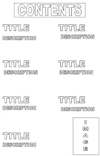
Below is an image of the first real draft of the contents page. As you can see, I have ensured that the page keeps the black, blue and white colour scheme throughout to show consistency, and also, the articles featured in the contents page are the same as the ones that appear on the cover. This ensures the appearance of legitimacy which is important, because only a few pages will be made and that could lead to forgetting about the other pages that are mentioned. I’ll remember to try and link things in my music magazine such as all the titles on the cover appearing on the contents page, and all the page numbers on the contents page matching those on my double page spread.

S C H O O L - M A G A Z I N E - C O V E R

I finished the school magazines cover. Finally, I decided on the name 'Ed', short for education. I decided to use this title because it was short and relevant, also, people would remember the name because of its short length and simplicity. This is what the cover looks like:


The image of the woman that I used was appropriate because my target audience did not say a preffered gender, and seeing as my audience was more female, I decided to put a female on the front cover giving direct eye contact to catch the attention of the ntended target audience. I also used a range of blue colours and stuck to two clear fonts, one that was professional and slightly formal, and the other, Arial (in the sub headings), like the target audience has asked, which was very clear and easy to read.
I also made sure to date and price the magazine.

Here is a review of my front cover made by another student:
Peer Evaluation of College Magazine Front cover
Look closely at the text you’ve been given. Use the following questions to guide your own examination of the text’s strengths and the areas in need of development. Offer constructive points wherever possible.
Front Cover
· Does the front cover engage the reader’s interest immediately – if ‘yes’, why do you think this is. If ‘no’, write 3 suggestions to improve this quality? (i) Yes – has a clear colour scheme which is very attractive
(ii) Background is plain and makes the person on the front stand out therefore eye catching
(iii) Simple not cluttered and attracts the readers eye
· What do the sell lines reveal about the potential reader?(i) Someone interested in going into university in the near future.
· Who do you think this magazine is targeting and how can you tell?(i) Year 12/13 as they mention University and ‘have you got the grades’
· What does the representation in the image and/or in the language tell us about the potential reader?(i) The image suggests that the potential reader could possibly be someone smart and very interested in the more academic subjects.
· Offer one comment about the use of image. It can be either positive (although remember that your aim is to help the publisher improve) or constructive.(i) The left part of her shirt kind of blends into the background, however the majority of the girl is outline by a shadow which makes her look more 3D.
· Offer one comment about the use of language. It can be either positive (although remember that your aim is to help the publisher improve) or constructive.(i) The language is not overly formal and has a light tone to it.


I N I T I A L - S C H O O L - M A G A Z I N E - D E S I G N

The answers to my questionnaire indicated that the target audience for the school magazine were keen on pale colour schemes, such as black/blue/white and liked clear fonts such as Arial. I already had a model in mind of a girl in a laboratory coat and the idea to have a mid blue colour scheme. Below I have placed an image of the initial sketch that I drew for my school magazine.


Here is the final sketch that I created in full detail: